How to Wear Prints
Before attempting to combine two or more prints and patterns in your statement piece, learn how to include only one pattern at a time.
This will allow you to get more comfortable wearing many prints at once in your fashion statement.
· Choose one of your favorite color tones, one of the top tips for wearing prints and patterns is to concentrate on the color palette.
· Wear a pattern or prints under a more neutral piece, finding a design that you can wear beneath something is the best method to incorporate a print into your current wardrobe.
· Choose a print that complements your choice color, such as plaids, pinstripes, gingham, or other patterns.
· Begin with a printed or with a pattern piece of clothing that isn't too obvious. You can start with a simple scarf, socks, or headpiece such as a headband and summer hat.
Tips For Mixing Prints To Have A Unique and Very Stylish Fashion Statement
Mixing prints may be delicate and understated, or loud and flamboyant, whatever your style, it is a way to exude confidence and add a playful aspect to your ensemble. Below are some recommendations from Just4unique on how to properly mix prints and patterns to create a unique and trendy look:
Mixing Prints Tip #1:
Make sure your printouts are in proportion, including a variety of sizes in your appearance adds structure. This entails examining the print's proportions. Wear a shirt or dress with a little floral print and match it with a blazer with a dramatic striped design or jeans with a gingham print to accomplish this style for example.
Combine tiny and large prints or a busy image with a simpler one. A basic little polka dot can be paired with a bigger striking design. A fine stripe might be paired with an extremely bold stripe. Mixing loud prints with Simple equivalents nearly always works.
Mixing Prints Tip #2:
The following are some common patterns and prints that you may start mixing:
Stripes - Stripes are one of the most frequent patterns in everyone's closet. Because they're essentially neutral, they may be used as a starting point for pattern mixing and match nicely with almost any design. Stripes come in a wide range of colors and patterns. With stripes, you have a wide range selection of colors, it also has a different width, which ranges from thin to bold to anything in between!
Plaid - Plaid patterns vary in size, color, and a number of colors. Mixing with plaid is so easy, for starting just try mixing and matching two plaid designs. When matched with a smaller, busier, more colorful plaid, a huge, plain plaid looks fantastic.
Polka dot - Polka dot is a common print or pattern for everyone's clothes, mixing a polka dot pattern with another polka dot design with larger or smaller dots, is one of the more amusing pairings for most fashionistas. It is recommended to choose a big prints polka dot for the top and a small prints polka dot for bottom wear like skirts, shorts, and pants.
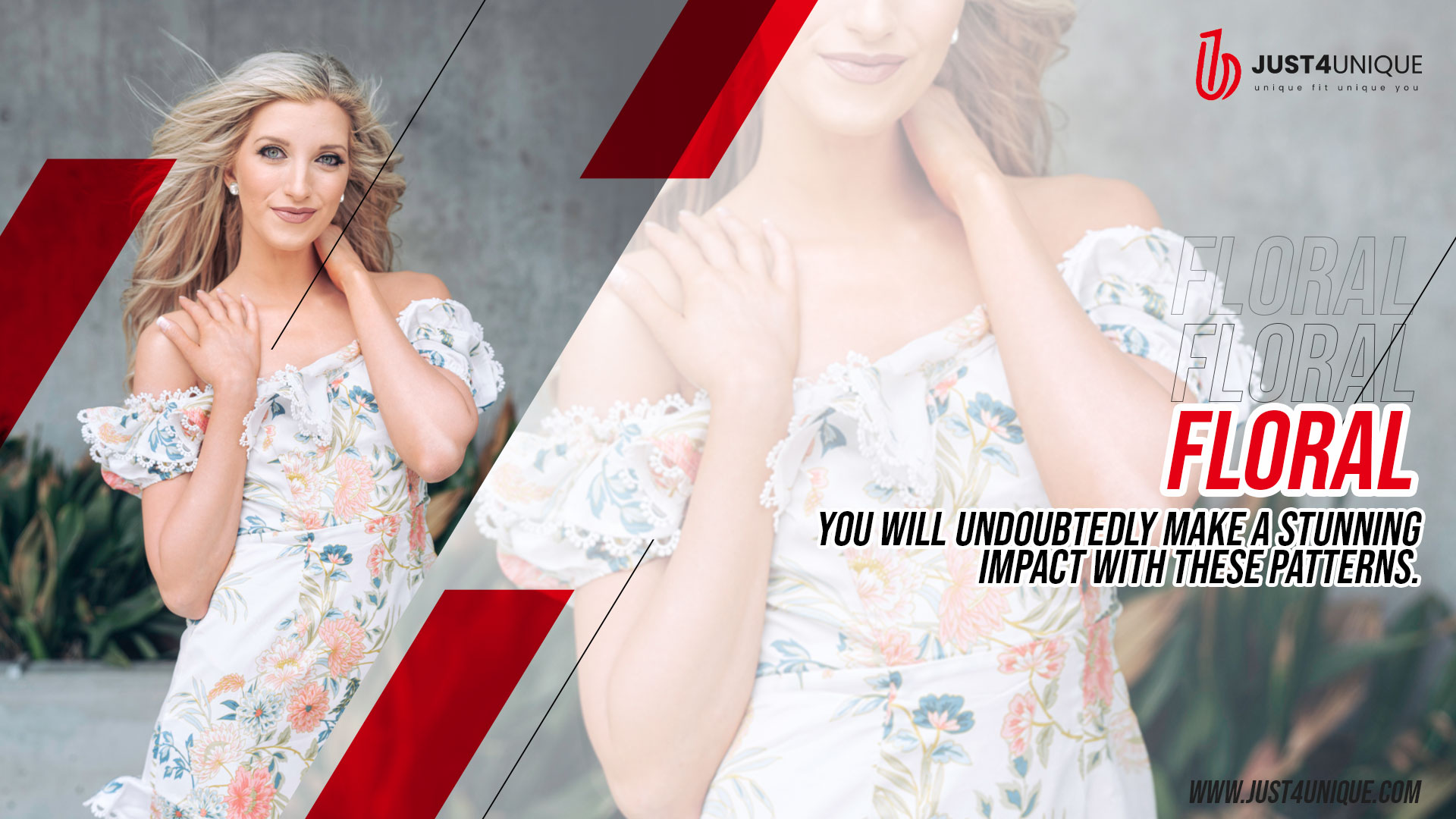
Floral - Floral is one of the fun and trendiest prints of all time for most females, it is traditional and flexible. Whether you choose bold florals or ditsy florals, you will undoubtedly make a stunning impact with these patterns.
Florals and stripes are some of the best introductory pattern combinations. Mix and match both designs and colors to produce a plethora of beautiful pattern mixed ensembles appropriate for any event.
Mixing Prints Tip #3:
Pay great attention to colors while dealing with mixed prints (One of the simplest places to start is by having black and white color tones).
Bold patterns in neutral hues, such as black and white, might help to balance off radically contrasting patterns in brighter color tones.
This is an excellent tip to start for someone who is unsure about their ability to blend prints. Instead, we recommend becoming a little braver and experimenting with a vibrant color
palette.
Mixing Prints Tip #4:
Mix prints with overlapping colors, combine a black and white stripe blouse with red and white stripes skirt for a summertime look, or Pair a monochrome print with a print with an
overlapping, matching color, for example. For spring, mix a bright square pattern shirt with playful printed slacks, or add a fair isle cardigan in complementary hues for an autumn day. You could also do the reverse and use two different colors of the same design.
Even if the prints clash, if they have the same color tone, you can still achieve an effortlessly cool look.
Mixing Prints Tip #5:
If your choice of print is too bright or overbearing for you, break it up with a solid neutral. Wearing a geometric design from head to the toe may be too much print and requires
the addition of a neutral solid for a polished effect. Allowing the print to show through is an excellent way to avoid pattern overload. To soften the look, pair bright designs with a solid-colored blazer or cardigan. When blending two opposing prints, a solid-colored belt might be used to break it up. Adding a solid or neutral to your strong print can give it a more understated effect for a more unique and stunning fashion statement.


Sign In
Create New Account